— PROJECT NAME
JP Vision
— ROLE
Design Strategy
Design Research
User Testing
Wireframe Design
— Team
Yong Zi Fong
Rao JingYu
Valerie Tan
— Supervisor
Asst Prof Dr. Jung-Joo Lee
— DATE
Aug – Oct 2018
13 Weeks
To design a single operational dashboard to view overall port status. For senior management to make better informed decisions.
Jurong Port, a leading multipurpose port operator handling general cargo, bulk and containerized cargo headquarted in Singapore.

WHY REDESIGN A DASHBOARD?
Industry 4.0 where many business operations are digitalising and starting to automate. This is a great challenge to Jurong Port as a multi-purpose port where the products they bring in are not containerize.
Products they bring in could range from the train cabins that we commute in everyday, the sugar we add in our coffee and steel that are found in the construction of our homes.
IMPACT
With goods and commoditity ranging in different size and shapes. It is difficult for Jurong to scale on automation for operational activities.
Hence, it is vital to have a strong understanding on day to day operations on the ground as timely decisions are key for optimum productivity.
Concept Video
START OF PROJECT
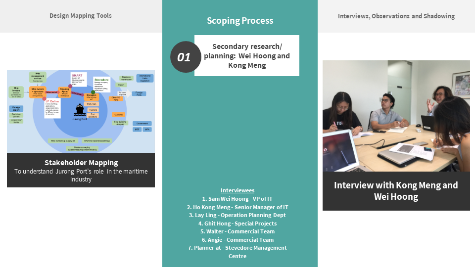
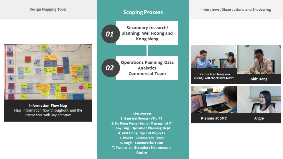
Interviewing teams from different department to have a overall macro understanding of Jurong Port’s business operation. At the same time, identify potential areas that to design the operational dashboard.


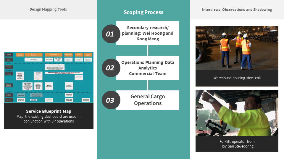
Walking the ground to understand the different port operation capabailities of Jurong Port.
What really struck to us was the sheer size of the port. We had travel by car just to go about the car.
At this stage, we could imagine the difficulty in communication just due to the size of the port and the nature of the dynamism of the port industry
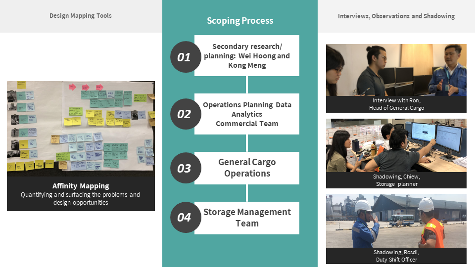
DATA ANALYSIS
Jurong Port handles cargo, and the journey is a
complex and multi-department journey. Hence
we treated cargo as the "user" in this scenario,
to map the entire journey of the cargo entering the port
to leaving the port, whilst understanding the supporting
departments and how they communicate with one another.


DEFINING THE USERS


CO-DESIGN

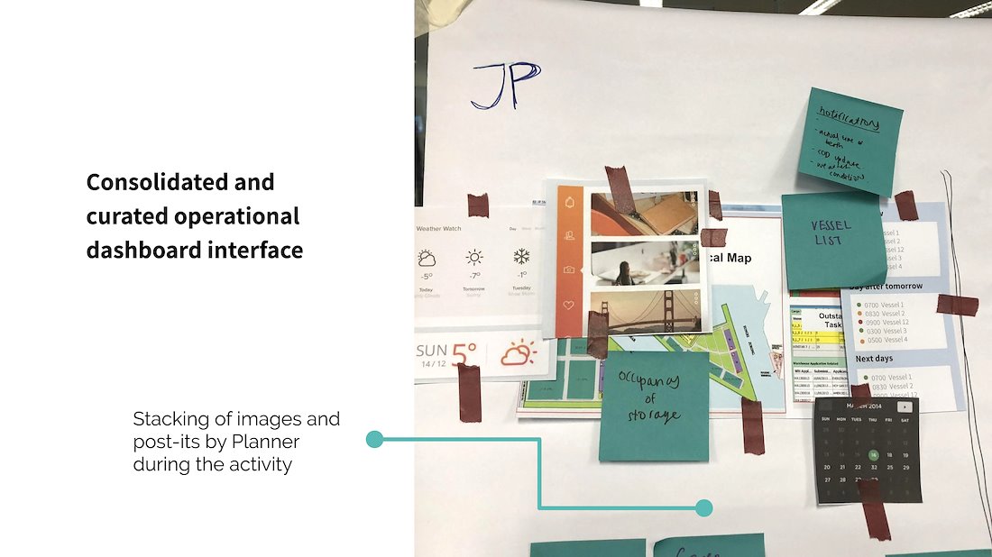
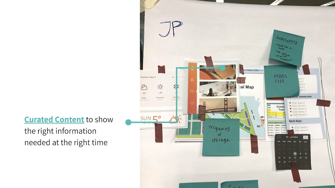
From this co-design, we realize there are many information that the storage planner needs which comes from multiple fragmented sources.
This causes much of time logging into different portals and clicking into several tabs to find correlated information.
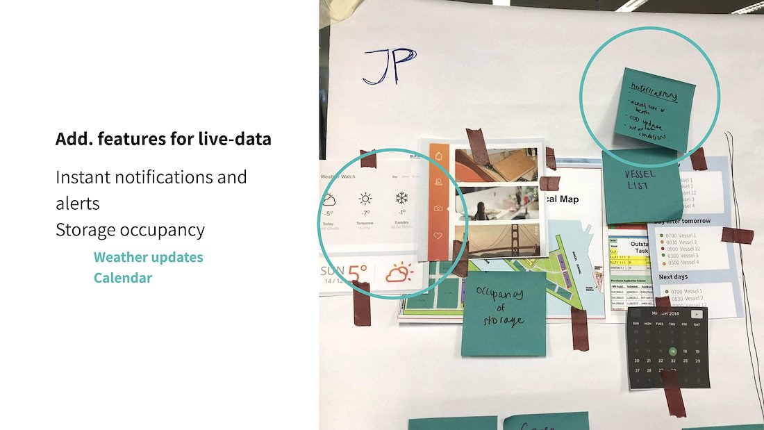
What was extremely surprising to us was the request for simple function like the weather. Due to their office having little windows, the planner does not know the weather conditions. This is crucial as when it rains, often lifting operations from vessels is stopped due to safety regulations which may interupts the movement of goods in the port.
We also discovered due to the huge variability of goods handled in the multipurpose port. Large objects like steel pipes are kept in
open yards and Duty Shift Officers has to do ground
checks daily which are often manual and inefficient.
ITERATION 1


Leveraging on existing User Interfaces of having a
map in the centre for ease of learning.
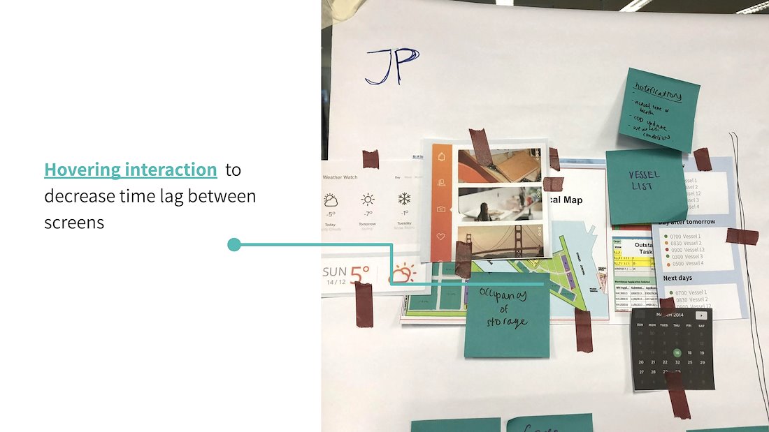
We introduced strategic hovering
User Experiences on the dashboard to
have instant access of information on the ground.
While addressing the manual inefficiencies on ground, we propose cameras in warehouses to view live occupancy status to replace ground checks.
CO-DESIGN 2


The hovering user experience was well received
Then comes a new set of challenge, the hybrid manager having
no access to information whilst on the ground.
Often needing to go back to office or print
hardcopies prior to going to the ground.


